Overtone
Services
Brand Identity & Visual Systems
Client
Overtone Magazine
Software
Adobe Creative Suite, Figma
Year
2024
Info
Overtone is a newly established Korean online music magazine featuring album reviews, columns, and interviews. Unlike traditional music platforms that bury critique in long-form blogs or scattered comment sections, Overtone introduces a sharper format: short, direct critiques on released albums, designed for how people actually consume music opinions today.
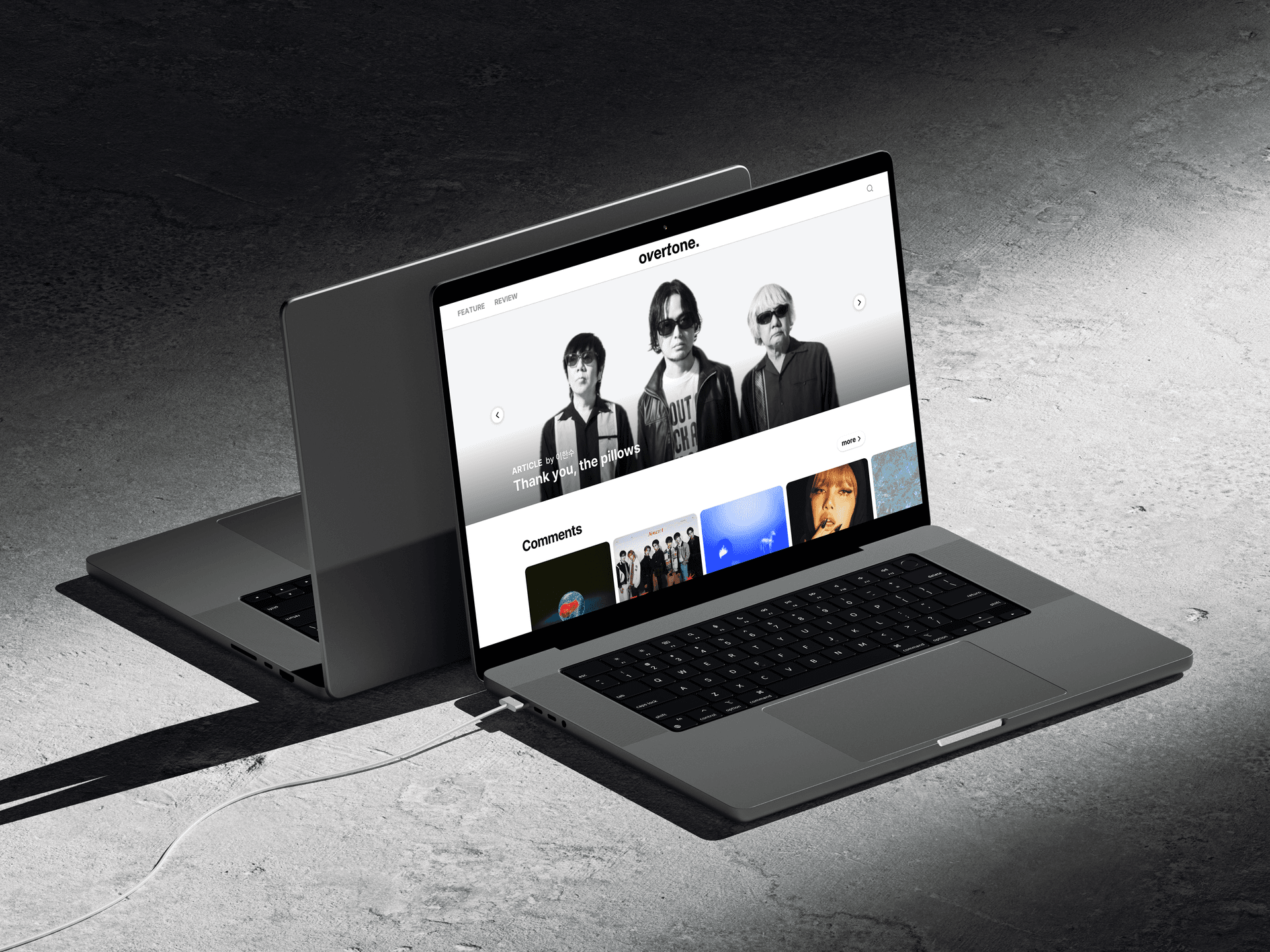
As the sole designer, I was responsible for the entire website from UI/UX to interactive elements, alongside core branding: a modern black-and-white typographic logo and social media templates for brand consistency. To bring the comments feature to the forefront, I designed a "comments card" inspired by Instagram's swipe interaction, where users can slide up or hover over an album to surface quick reviews instantly, making critique feel as immediate and social as a feed.


Process & Visual Identity
The client requested a modern, black-and-white sans-serif logotype. I used Helvetica Neue for its clean, contemporary feel, and italicized the V and T to subtly echo a soundwave rhythm while keeping the design minimal and modern.
Alongside the logo and brand identity, I designed social media templates for sharing the magazine members’ album review posts. A curved line element was added to visualize the ‘overtone’ soundwave and maintain consistency with the brand’s visual tone.